Component 1, Section A: Media Language –
Exam preparation
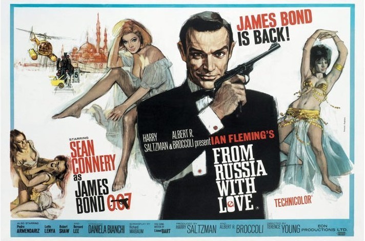
The poster for the ‘James Bond’ film, ‘From
Russia With Love’ instantly creates enigma in several ways for the audience as
well as providing several denotations to be explored. Roland Barthes created the idea of semiotics. This is the theory that media texts have signs that convey a meaning to the audience. A sign is something within a text that signifies and constructs a meaning. For example, within the poster, the bottom-left shows two ladies fighting in anger and injuring each other. This connotes action and could signify that there will be several scenes similar to this with other people engaging in conflict. The poster is a
drawing rather than being made up of photos. This could suggest that the film
is full of fun and action, as the almost cartoon look to the poster supports
this. The colour scheme of the poster appears to be black, white and red. These
could all connote a variety of meanings. For example, the heavy use of red
across the poster could connote violence and action that the film includes. It
could also be a reference to the introduction scene to the majority of ‘Bond’
films, where 007 appears in the centre of the frame and shoots towards the
camera, where the solid red colour drips down the screen to cover it fully. The
use of the colour black could connote stealth and espionage, as ‘James Bond’ is
a spy who stays hidden when killing his opponents.
The close up of ‘Bond’ in the middle of the poster conveys that he is predominantly important within the film and clearly the protagonist. ‘Bond’s clothing within the poster once again suggests that he is a spy and excels in his occupation. The positioning and clothing of the woman in the poster could be seen as demeaning as they are on the side of the poster and not within the centre in terms of the rule of thirds. The women are sexualised as they are shown to be wearing either a small amount of clothing, or that their features are teased. This illustrates the sexist representation of women in the film and also appeals to the male demographic. The fact that this is included in the poster, conveys Bond’s success with women. The font within the poster is sophisticated and creates a formal mode of address. This is in concordance with Bonds smart presentation through his clothing. In the top-left corner of the poster, a helicopter can be seen as well as what looks like a car stuck on a train track. This creates an enigma for the audience as it builds tension, whilst the audience wonder what the consequence could be as well as how that scenario even happened.
The stars and cast are credited at the bottom of the poster, along a bar. This is effective as it includes those who were responsible for the film without covering the main images of the poster. However, despite this, several names appear across the images. This is to persuade the audience to see the film as they may recognise an actor (in this case Sean Connery) that they may admire or a director. The inclusion of the Soviet Union logo implemented with the stylised 'o' in 'love', presents iconogrophy of Russia - the setting and topic of the film. The tagline of the poster, "James Bond is back!"is impactful. The alliteration of the 'b' sound makes it seem fun and attracts the reader. It is short and persuasive and may convince the audience to go and see the film. Steve Neale's theory of genres is shown within this poster. The theory of action is distinctive as Bond holds a rather large pistol in his hand that fills the middle of the rule of thirds. The genre is very recognisable and stands out. Tzvetan Todorov's theory of narrative can be loosely applied, as the image of Bond holding a pistol implies that he will be shooting and fighting others.

We'll Strike Again Article
The fact that the newspaper is a tabloid rather than a broadsheet means that there is likely to be a less formal mode of address. This is reinforced by the inclusion of the story about Emma Willis at the top right. This story is about Emma "delivering babies" which is not the primary story and not what the majority of the consumers would consider serious or relevant news. Despite this, consumers may be attracted to the newspaper due to this side story and be interested to find out more, therefore proceeding to purchase the paper.
The main news story is about air strikes in Syria, which is a shocking and significant topic, and one that people need to know about. The main image shows the destruction caused by the bombs. The newspaper positions the audience in a sympathetic way in order to make people feel compassionate for the topic. If they wanted to present the alternative narrative, they would have showed weapons or bases destroyed showing that the strikes were successful, but instead the main image is one of what looks like a house destroyed which gives the impression that innocent people might have been hurt. The pictures of the leaders of the countries show the readers where the blame lies for the destruction and almost makes the audience oppose them. However, the pictures are neutral so this viewpoint could be challenged. The simplistic font of the headline on the front page is impactful as it doesn't distract the reader from the tragic image. The statement at the top of the cover says 'US and allies ready for second blitz on Syria' which shows that the newspaper is hyperbolizing the attack as they use the word 'blitz', which means an intensive or sudden military attack. The newspaper thinks that the strikes were prolonged and extensive and that they were maybe uncalled for. this statement puts across their viewpoint on the event. The dull colours in the image could also reflect the serious nature of the article as they imply feeling of sadness and remorse.
The article also partly pins the blame on the reader as well, saying 'We'll strike again,' which implies that the reader was involved with the strikes and so the reader partly feels like its their fault and so this again shows the personal viewpoint of the newspaper again. The exclusive story at the bottom of the paper is also used to draw the audience in as the word 'Exclusive' makes the reader feel as though they are the only people with access to this story. This story is also a very topical subject and so many people will want to read the newspaper.
The images at the bottom of the article are also somewhat unflattering angles and so this portrays them in a negative light which puts across the viewpoint that these leaders are the reason for the strikes and tries to make the reader oppose these people.
The theory of Roland Barthes semiotics can be applied to this cover, as there are signs on the cover, such as the bland picture of the destroyed house which could be interpreted as the writer implying that the strikes are a negative thing, but it is up to the reader to how to decode the image but the way that the writer wants the reader to is very evident and this is the way that the writer of the article intended the audience to decode the article.
No comments:
Post a Comment